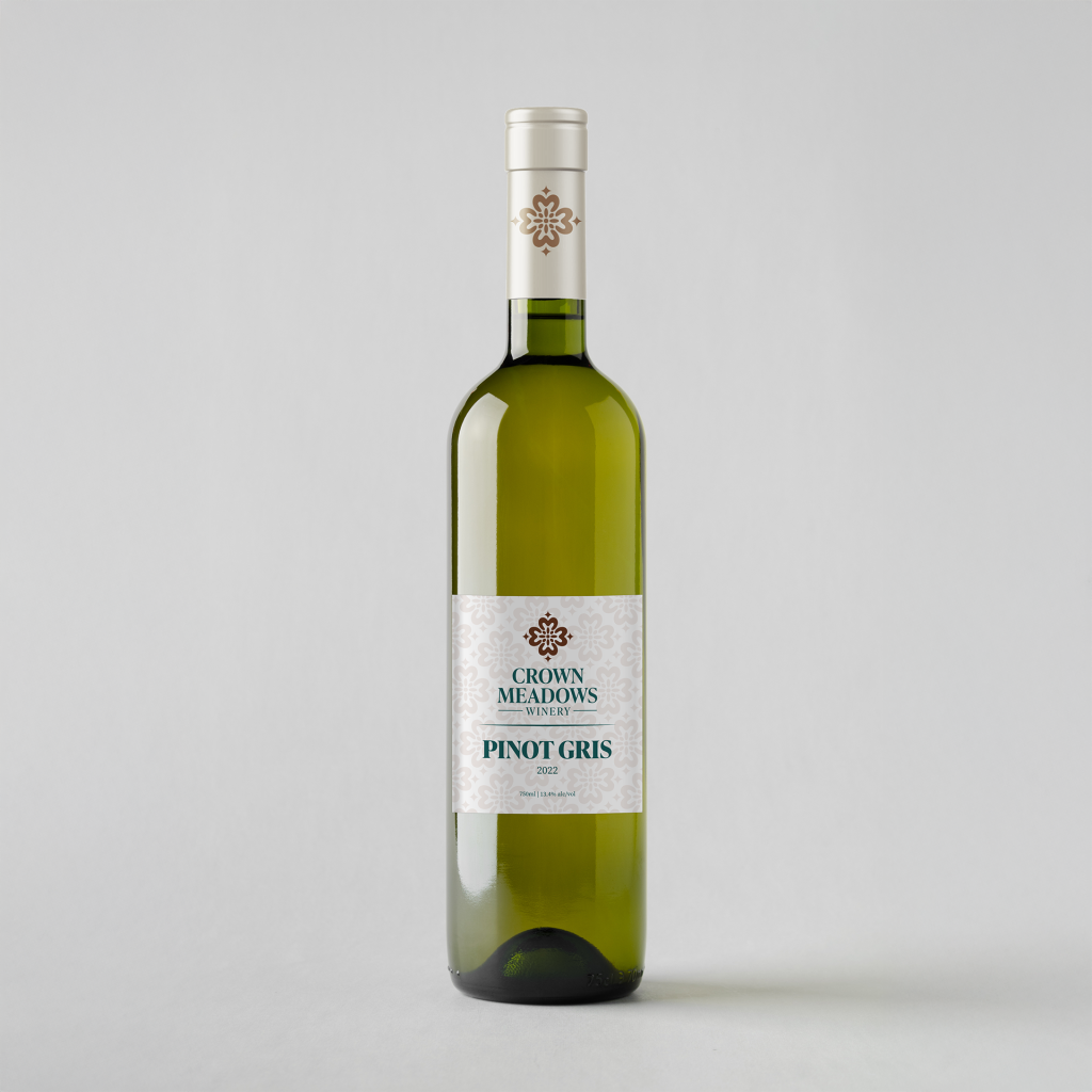
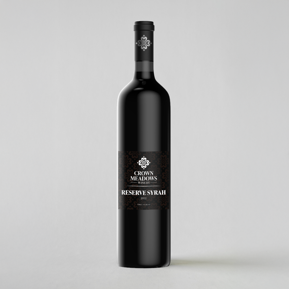
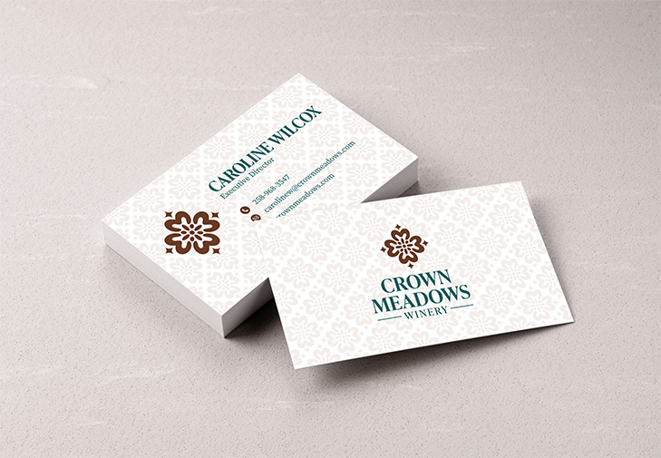
Crown meadows is a winery based in Goldendale, Washington. The client was looking for a re-brand to convey an elegant but contemporary look with a nod to Spanish influence, aiming to attract a younger audience. During the design process, I was inspired by the patterns and symmetry of Spanish tile-work. This influence led me to create a brand mark that combined the ideas of a crown and a flower together in the shape of a Spanish tile.
For the typography, I chose a serif typeface for their logo type and body type. This choice was because of its elegant but timeless look and its readability across many sizes and mediums. Finally, for color I chose a natural and complimentary palette of a navy blue and brown set against a beige patterned background. Which aligns with Crown Meadows goal to pair Spanish tradition with modern youthful design.

Leave a Reply